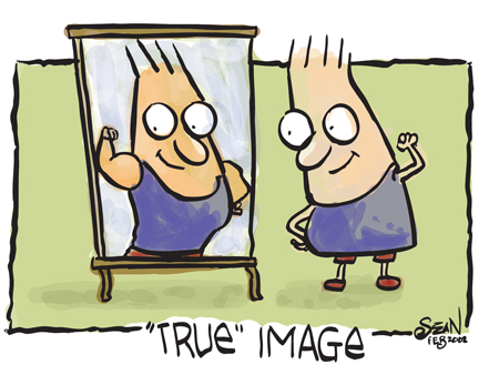
When we look at a photograph, we start seeing ourselves, even without meaning to do so.
This is why you can never put a ‘problem' in your photograph.
But how can that be true? When you see the newspaper photos, they always seem to have something that's blown up, or burnt down, or something that seems to be a problem. Ah yes, but that problem is meant to get your attention. And it does a great job keeping that attention when it's editorial-based.
But when you're buying something you don't want to see problems.
You don't want to see soap for ‘normal women' (no matter what Dove Soap thinks).
You don't want to see a guy with a big fat paunch, selling you a fitness program.
What you want to see is the finished product.
You want to see the woman with the silky soft Dove skin.
You want to see the guy all muscular with these rippling abs.
And bizarre as it may sound, you see yourself in those photos.
Photos have an instant impact. There's zero ambiguity.
But words have a completely different impact. Therefore words should never be solution-based. Because that's the job of the photo. The words need to bring out the issues at stake. This is because you need the words to act as an attraction device. And the best way to attract the brain is to drive home the problem.
Which is why, when we look at the cover of Men's Health for instance, the headline says: ‘Go from fat to fit.' Or ‘Scrawny to Brawny.' And that's the headline doing its job bringing in the problem—and only then the solution. The photo on the other hand doesn't have a problem at all.
So remember:
1) Headline=Must have a problem (and solution). If you can't fit it all on the headline, use the subhead.
2) Photo= Must have the solution. And nothing else. Show the final product or service in all its glory.
Photos are mirrors. Don't forget that!
And yes, don't forget to make sure you read the Brain Audit (if you haven't done so already). It outlines in great detail how a customer thinks and why they do what they do.

Found you on CopyBlogger. Absolutely adore this blog.
95% agree with you on this post. In my reply, I will focus on the other 5%.
What about…
– ads for charities, which picture somebody starving, or an animal that’s been mistreated. These pics are a problem.
– Lots of religious tracts have pictures on the cover of somebody in a bad situation — crying, lonely, or even in hell.
Do you think these ads are less effective, or are they exceptions?
Yes, they are less effective. In fact World Vision realised this quite early. Their graphics and photos show kids whose lives have improved. Watching a starving person is counter productive. It first kinda jolts you. Then you feel guilty, but over time you get inured to it.
Editorial and advertising aren’t the same. Fires, tempests etc. work well for editorial, but for advertising it’s critical to have a solution for a photo. As World Vision and World Wildlife do.
As for religion: Well, that’s driven by a different agenda. Religion per se is hard to justify without an afterlife. Think about it. If there were no afterlife, then why would you stick by the rules?
Even so, the marketing of hell is mostly done by words, and audio, rather than pictures. I can’t comment a lot about this topic, because I don’t see a lot of these pictures.
However it’s important to understand that the agenda that people used in the past, may not work in today’s world. And that’s key to succeeding: Understanding how people react today, and now.
Hi Sean,
brilliant stuff, as always.
I was just wondering, what about “before-and-after” type pictures?
Would that be an exception to the rule? It would seem logical, since it’s just the visual application of the problem>solution concept, but for some reason, I feel that the solution only-pictures STILL work better.