New! Critical Website Components Series (Version 2.0)
A series of three books on how to create "Home Page", "About Us" and "Get Customers To Sign Up" to your website/blog.
Do you feel like banging your head against the wall when writing content for the important pages on your website?
How do you write sensible, yet compelling content for pages such as your Home Page, About Us page etc? Wouldn't it be just wonderful to have a systematic approach to create the important pages on your website?
Most website-based books talk about usability and design, but often all you really want is a way to be able to write the important pages.
You want a simple, step-by-step method that will help you put the content together. You know you need content on your “Home Page”, your “About Us” page. And yes, you very much need clear instructions on “How to get customers to sign up”.
And no matter how much you seem to look, most books don't seem to give you a system. Instead they show you tons of other websites, never stopping to put together a system you can easily follow.
But even if you do have a system, it's important that the system be flexible
A rigid system is useless, because it doesn't allow you to be yourself. A fill-in-the-blanks system isn't of much use to you either. That makes you feel like a robot just filling in blank after blank. Instead what you need is the best of both worlds: a system that allows you to take the steps with confidence + let your own personality and voice come right through.
Introducing Critical Website Component Series (Version 2.0)

The Critical Website Components Series is where we take apart sections of the website and analyse them in great detail. We take a look at the core principles that need to be considered, then take a look at websites out there and how they're using these principles. And finally, we have a step-by-step method so you can put your pages together.
That's the biggest problem, isn't it?
Putting it all together is the most frustrating exercise ever. Because it's seemingly so hard to do, we keep putting it off until later. Or we just put together a page, so that we have something online. And that's why the Critical Website Components Series is so useful. It helps you:
- Put together specific pages on your website from scratch.
- Audit your existing pages and see what's missing.
The Critical Website Components Series (Version 2.0)

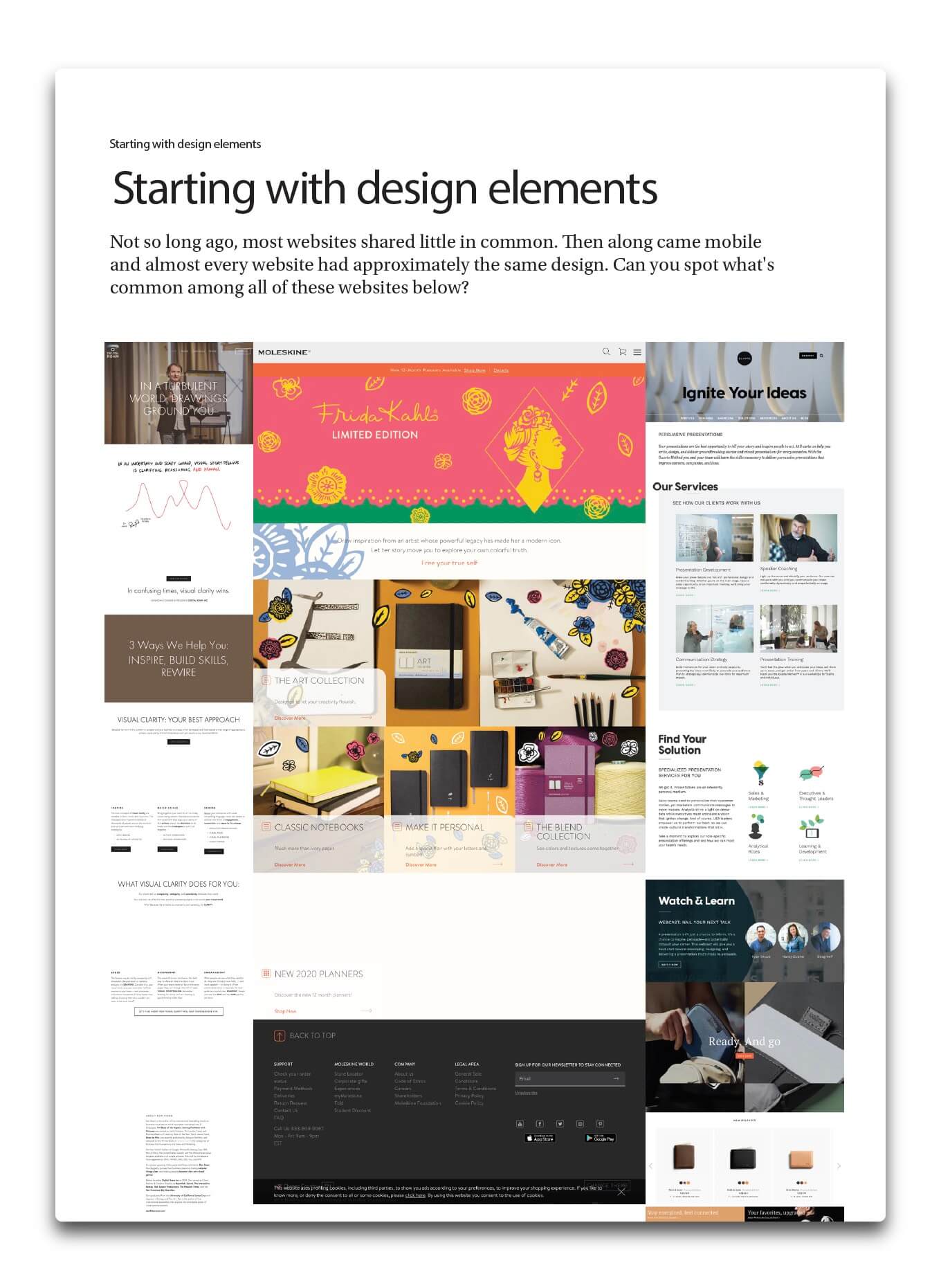
The Website Components Series helps you better understand how to design a solid home page that helps customers find their way around. It also enables you to create an ‘About Us' page that sets your website or business apart from competitors. Best of all, it plays a big role in creating a clean, non-creepy sign-up route to your subscribe page.
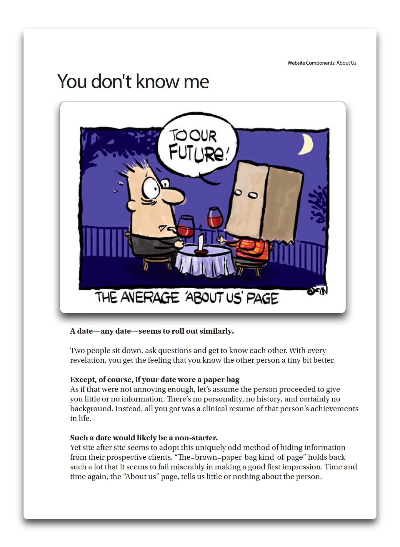
Book 1: The About Us Page—Why You Need To Throw Away Your Brown Paper Bag

The first idea you get when someone asks you to write an “About Us” page, is that the page needs to be about you. Oh well, it seems like it's supposed to be about you, but in fact it's about the customer. But wait, how could that be possible?
In this 28-page book you will learn:
- The importance of trust on the about us page
- How to use photos creatively and still be yourself
- The ‘Zorro Syndrome'—how to hide your face but not your personality
- The best way to goof up an “About Us” page
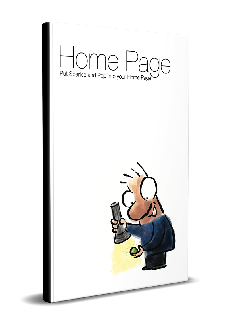
Book 2: The Home Page—How To Put Sparkle And Pop Into Your Home Page
Everyone has a home page. And yet so many home pages are quite ineffective. What's happening? Why do home pages go awry when they're the page almost every visitor sees?
You may have books on how to make a page look good and how to create usability. This is different from both. What this book does is show you how to drive the customer forward using both text and graphics.
In this 47-page book you will learn:
- What is the purpose of the home page
- How to choose a graphic layout that works for your business
- How to create the right points of interest for your site
- How to stop your visitors from looping mindlessly
- The four elements every home page needs.

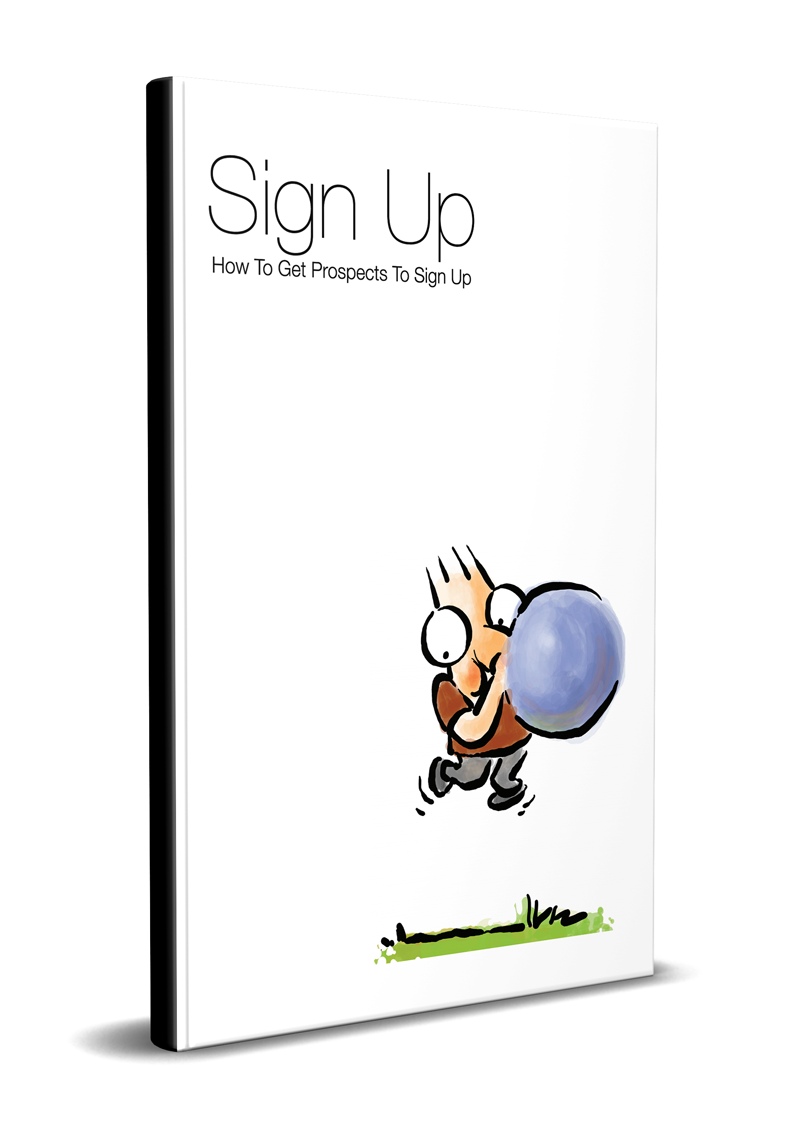
Book 3: Getting To Sign Up—How To Create A Clear and Simple Route For Subscribers

If you go to a pond where there are lots of fish, will you catch fish? No you won't. You know as well as I do, that you could be there all day and never so much as get a nibble on your line. And that's because you're not attracting the fish.
The same thing happens on your website or blog—if you want someone to do something, you're going to have to give them a reason to do that something.
And here's what you will learn in this 28-page book
- How to decide the right route to sign-up
- How to create a non-creepy route to your subscribe page
- Why reports matter
- The Psychotactics route to subscribe and how it works

Kyle Newell,
NJ, Somerset, United States
The biggest obstacle to buying the Website Components Series, would just be that it could have been ‘one more thing’ to add to my list. Also web work is not my favorite subject area.
I found that the product provided clarity as to what should go where. There is so much nonsense talked about when it comes to web design.
It was great to have a clear answer from an authority!
I personally liked how to set up the home page the best
It allowed me to give a bit of background about myself, yet it kept things simple and helped me to connect more with my prospects. This was so much more effective than just listing out the benefits on the home page.
Three other benefits would be it saved me a ton of time, gave me clear instructions and allowed me to use my brain for other high level areas of the business!
I would definitely recommend the product, especially considering that most people have been lead down the wrong path and their website is more of an obstacle than a conduit to creating new clients.
I would add that my website is still far from perfect, I need to go through the manual again, which I will. And I know that each time I go through it, I will learn something new from it to apply.
I do know my website was a mess before finding this manual and I even had a pro design it.
Thanks Sean and Renuka!
Kyle Newell
NJ, Somerset, United States
What’s Inside?
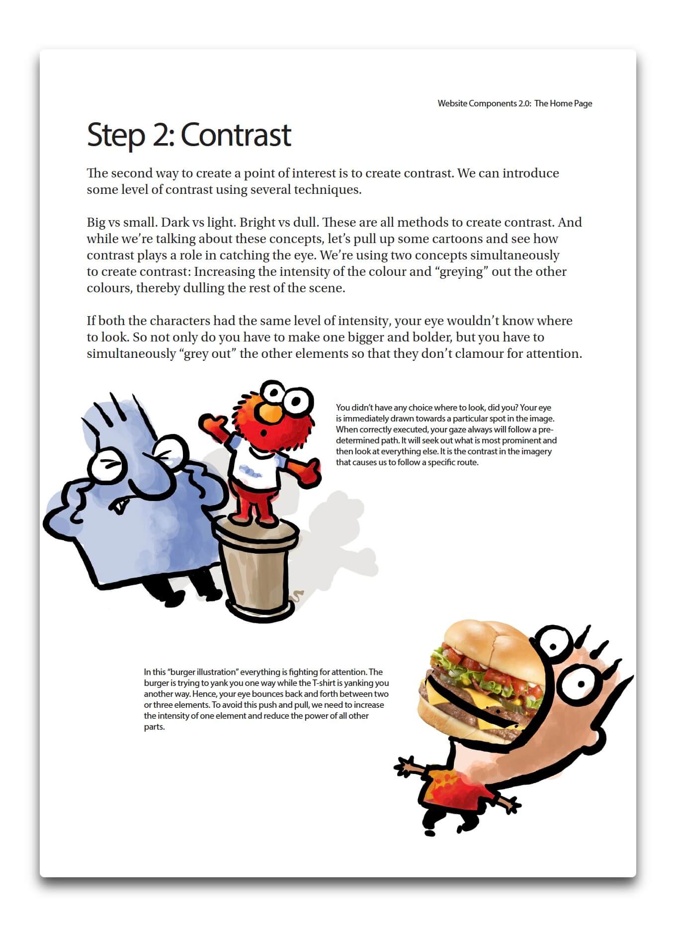
Most books are dull because they don't use graphics, cartoons and captions. The use of the above elements make the reading of the books a very pleasurable experience. Sprinkled within the chapters are lots of examples, so you can get ideas for your own business. Plus there are always detailed summaries that gives you a bird's eye view of every chapter.

Philip Riggs,
Fort Collins, CO, USA
Would a person really need a whole book on home page design?
“Most websites put up some text about what the website is about, or maybe some photos of products or services. It's pretty simple to set up a simple home page.
But I've been to too many of these websites that were so confusing I didn't know what to do. That was exactly what I didn't want. And while there are plenty of books on how to design the appearance of a website, I wanted something that showed me how to design for usability.
I didn't realize how easy it is to make a home page confusing. I also never thought about text-heavy home pages versus graphics-heavy home pages.
The booklet shows three methods to make a website clear for a customer to find what they need. And the three methods are easy to understand and implement. They are presented very clearly and supported with lots of examples to help the learner apply the methods.
I would recommend this product to anyone who wants to better understand how to design a solid home page that helps customers find their way around and do what you want them to do.
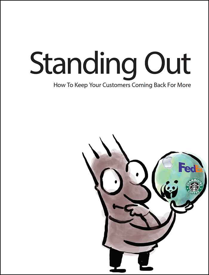
Bonus (Only with Premium): How To Get Your Customer To Come Back (PDF)
- How To Amplify Your Brand With A Story
- How To Create A Stickiness Factor For Your Company
- How To Deal With The Flip Flop Syndrome
- The Flaw In Creating Your Uniqueness
- The Zap System: How To Get Your Customers To Notice You
What’s Unique About This Book?
The books are not just conceptual, but show you how to create the content and design. This allows you to quickly make changes to your website or blog. You need something that you can apply straight away—and see results.


Smiley Psychotactics Guarantee
What if the product isn't good for you? This product is guaranteed for a whole month. If for any reason (and you don't have to give a reason) you don't like the product, you can ask for a full refund. And we'll refund your money with a smile.
Here's what you'll receive


Please note: These are digital products. In effect you get e-books (PDF). The images above are just a representation.
| The Critical Website Components Series (Version 2.0) |
Regular | Premium |
|---|---|---|
| Booklet 1: The About Us Page (PDF Valued at $39) |
||
| Booklet 2: The Home Page (PDF Valued at $39) |
||
| Booklet 3: Getting To Sign Up (PDF Valued at $39) |
||
| BONUS | ||
| How To Get Your Customer To Come Back (PDF Valued at $25) |
||
| Special Price | US$ 47.95 | US$ 49.95 |
| Pay safely with any of these options |
||
| Pay by PayPal | ||
| Pay by any Credit Card | ||
Important Details:
If by any chance, you are not able to validate your card please don't tear your hair out in frustration. You can email Renuka and she will send you an ALTERNATE LINK to process your credit card. All payment systems are secure.
If you have any questions that have been unanswered, please email me directly and let me know how I can help. I'd be interested in getting your feedback. The feedback that you give me is strictly confidential. Don't forget to include your telephone number and a time to call you.
Important: What will happen once you click the button
—You will be taken to a page where you can fill out your credit card details.
—Once you pay you will be taken to a form.
—Once you fill the form, you will receive an email with more details.

Sean D'Souza
Psychotactics.com


