 After the home page, the second most-visited page on many sites is the About Us page.
Yet almost all the About Us pages you visit are drab, long winded or don't give much detail at all. If you already have an About Us page going, here are three quick fixes that will dramatically improve the visual and the text on your site.
Right click here and ‘save as' to download this episode to your computer.
In the late 1970s, when you asked for coffee to go, you had to tear a hole in the plastic lid, just to drink the coffee.
Until a couple of food engineers, William and Kenneth Dart came along.
They looked at the lid and made one little change: a press down tab that seemed much like a valve. They called it the “lip-engaging buttress, and if you wanted to sip your coffee, you merely had to push on it with your upper lip. When you stopped drinking, the tab would snap back into place and prevent spills.
This invention wasn't a complete re-engineering of the cup. Instead, it was a small tweak. Similarly, you too can make three minor tweaks and significantly improve your About Us page.
The three points are:
1—Orientation of your photo
2—Is your story a memoir or a history book?
3—How to write the page so that clients read between the lines.
1. The orientation of your photo
I was on holiday in Vietnam when I went for a photoshoot. It was a slightly remote fishing village about an hour from Hoi An, in Central Vietnam. One of the first instructions the instructor gave me was “don't shoot portrait, shoot landscape”.
If you look at a lot of photos on an About Us page, all you're likely to see is a mug shot
It's usually the kind of picture you'd find on a passport or driving licence. It might have been shot by a professional photographer in perfect lighting conditions, but there's a problem with that portrait shot. A portrait is often tightly cropped and has no context.
That message of “context” is precisely what the instructor was emphatic about
When I was snapping pictures of the fisherman in their unique fishing baskets, it was almost too easy to zoom into their faces, thus removing all of the surrounding contexts. The context included that they were on the water, that it was a stormy morning and that they were surrounded by fishing boats. Without all of that additional information, the picture had little or no context.
Our About Us pages can also suffer from this lack of context
When we first started Psychotactics, our About Us page had a slightly zany picture of me standing on one leg and flapping my hands. It was an interesting picture, but it was—like many pictures are—taken in a studio.
It was a portrait and with little or no context of the surroundings. When we launched our new website in 2018, we made sure the imagery had meaning. If you go to the About Us page today, you'll see a completely different image.
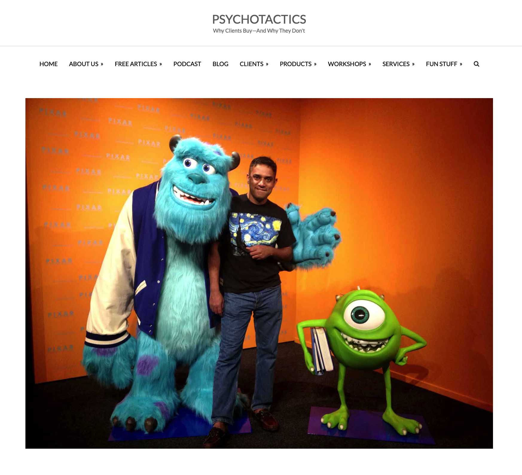
It's one of me standing in between two cartoon characters, Mike Wazowski and Sulley from the movie, Monsters Inc. It's not a studio image and was shot with a phone camera, but it has a landscape orientation and therefore has a lot of context.
In a matter of seconds, it gives you an impression of the person and a semblance of the things they're interested in.

It's not like you have to ditch the picture you have right now
You may still want to hold onto that tightly cropped picture of you. However, do put in some images that show you on a trip somewhere. Maybe you're into wood carving or pottery.
How about having a picture of you with a chisel or sitting on a pottery wheel? The change you're making is a rather tiny one. The tab on the takeaway coffee cup lid didn't involve a mammoth reengineering sort of drama.
Instead, it was a slight tweak. You too could dig into your photos and find pictures that give your audience a quick snapshot of who you are.
Ideally, make it landscape so that you can get in the context. 🙂
Which takes us to the second tiny fix: Is your About Us page a memoir or a bit like a history book?
2. Is your story a memoir or a history book?
I have a book that I intend to read in December. It's called “The Silk Roads” by Peter Frankopan.
In the book, Frankopan talks about the rise of the Western civilisation and how it didn't stem from the Romans, the Greeks and Egyptians. Instead, it rose from the Persian Empire. It's a fascinating book, but it's also 636 pages in tiny print. Which is why I've earmarked all of December for it, so long and winding is the story.
It's likely that the text on your About Us page isn't a behemoth like “The Silk Roads”, but it's easy to get carried away and tell the entire story. Instead, how about writing a bit of a memoir?
The difference between a memoir and a history book, is the point at which the story begins
Let's say we're writing a story about David Attenborough. We could start from his childhood and bring in the fact that he loved to collect fossils. Or we could fast forward to a pivotal moment, instead.
Like how when Attenborough was the controller of BBC 2, and suddenly the British government gave him the green light to introduce colour. And how, in a childish sort of way (his words, not mine) Attenborough wanted to be first in Europe.
What we've just heard is a tiny slice of the Attenborough story
That minuscule slice is the basis of a memoir. Instead of a chronological start from babyhood, we jump smack in the middle of a dramatic moment. And we continue the story from that point onwards without any drag.
The Attenborough story talks about how he had an incredibly tight time frame; how the Germans were close to launching around the very same period; how he couldn't possibly go from all black and white programming to all colour. And how he solved the problem by taking on something that would have all the drama, the pomp and yes, the colour.
He decided that the broadcast of Wimbledon was going to be his big colour TV moment.
“I was as proud as a peacock. It was absolutely terrific. It was a big moment in my life,” says Attenborough. And you too can be proud of the About Us page, if it's got that drama. Instead of simply scrolling back in time and then rolling out dozens of events, go to that precise moment and tell that one story. Make it a memoir instead of a tedious historical record.
In doing so, you can bring about the third quick fix too. And that is that you'll almost certainly get the client to read
between the lines.
3. Getting the client to read between the lines
Let's dart back to that Attenborough story, shall we? What were the points in that story?
Incredibly tight time frame
Germans were close to launching around the very same period
Dilemma of all black and white programming switching to all colour.
How he solved the problem by a piecemeal introduction of colour—using Wimbledon as the showcase.
The “incredibly tight time frame” tells you that Attenborough was given a challenge. That challenge wasn't only time- based, but with the Germans wanting to steal his thunder, he had to move “quickly”.
The line shows how, when faced with external threats, Attenborough had to think on his feet. However, as the drama unfolds, you and I realise that he has an impossible task.
He can't switch all the programming to colour, so he gets “inventive” and showcases Wimbledon instead.
If you took out Attenborough from the story and replaced it with someone else's name you'd still get the characteristics to read as:
Nimble
Good with facing great odds
Inventive
Rises to the challenge
The Psychotactics About Us page runs through a similar sort of approach
The text is broken up into three parts. The first part talks about how I got into an advertising agency and why the founder of the agency, Leo Burnett, had such an impact on me.
The first section briefly mentions how I made the transition from copywriting to cartoons and then moved into marketing. When you move to the second section, it's all about teaching and how my parents and my grandma was a teacher.
Moving to the final section, you're told that I wake up at 4 am. And that if you were to send me an e-mail, you're likely to get an instant response.
Did you manage to read between the lines?
Background in advertising with a well-known agency, cartooning, marketing = Lots of Experience
Why Leo Burnett, the founder made an impression with his work ethic and determination = Not your usual billionaire role model.
How there's a heritage of teaching in my family = Probably a good teacher
Finally, how I'm at work at 4 am and might I say, very approachable on e-mail = Hard work, approachable.
While Attenborough's story is a memoir, the Psychotactics About Us page isn't exactly a long history
They're just two methods in which to attack an About Us page, because no matter which one you choose, it creates an underlying message. It's not just a set of words that simply talk about “huge chunks of your life”, but instead give short, intense bursts of information.
The About Us page is often the hardest to write
We aren't sure how to talk about ourselves or what we need to say. Often we ramble on for no good reason. However, if you were to pick on a memoir—a brief but pertinent section of your life—you've made a great start.
If you then audit your page so that clients can “read between the lines”, you've taken the next step. And finally, make sure your photo has context. Having landscape photos are preferable instead of the tight-cropped studio photo that's best suited for
official documents.
Those are three tweaks.
Where will you start first?

Remarkable! Its genuinely awesome post, I have got much clear
idea on the topic of from this piece of writing.