Design Clarity in Minutes
How to put some sanity into your design with some really simple tweaks
Do you want to put some sanity into your design even though you are not a designer?
Learn how structure and guidelines of elements can immediately improve your design with simple tweaks.
Confusion isn’t hard to create.
And confusion leads to distraction. And distraction pulls you madly in all directions, so that you’re totally confused. So how do we tend to confuse customers? We tend to confuse them with elements, a lack of invisible lines and with too many colours.
Our websites, our brochures, our presentations are a mess.
And we don’t even know why they’re a mess—or how to clean things up.
In reality, a clean-up is not hard to achieve. If you stay within the structure and guidelines of elements you can immediately improve your design—even if you’re not a designer. And even if you don’t do your own design, you can make sure your designer isn’t going nuts on your next project.
In this 14 page document, you'll learn how you can design your website, business card, etc with a few fonts and a very small palette of colour. And make it look professional and stand out.
Introducing "Design Clarity in Minutes"

Almost everyone needs to do a little design every now and then. Sometimes it's needed for a flyer, or booklet. Or maybe a business card that's needed urgently. Whatever the need, it's possible to create a powerful, clean design once you understand the core principles of design.
I didn't. I started out in business, depending on others and not all the results were good. This frustrated me deeply enough to go across to my neighbour (who just happened to be designing for ELLE Magazine). I'd make dozens of trips trying to understand the very structure of what was needed to create quick, effective design.
This booklet is a product of years of back and forth. If you stay within the structure and guidelines of elements you can immediately improve your design—even if you’re not a designer. And even if you don’t do your own design, you can make sure your designer isn’t going nuts on your next project.

Bruce Brodeen,
Fort Collins,
Colorado, USA
I’m an idea, conceptual guy so communicating what I need an artist to do and keeping my ideas reigned in can be a struggle.
I’m not a designer but I have to hire em' out an awful lot, though.
I’m an idea, conceptual guy so communicating what I need an artist to do and keeping my ideas reigned in can be a struggle. (and, literally, I had a meeting a few hours ago with my graphic designer for a new project and pulled this information out when preparing for it…)
Sean is one of the most gifted teachers in the small business environment and intuitively knows how to work with ‘creatives’ who struggle with over-complicating things. He communicates in clear, simple and direct language —- for me, this allows me to get the concepts and understand what I must do inside a project.
There is never, EVER any fluff inside anything that Sean puts out – every little bit matters and is easy to digest.
“Design Clarity” has provided me with simple reminder to keep a keen understanding on what’s important and not lose sight on what is important from a prospect-oriented perspective.
If you are a visual, creative thinker who tends to over-complicate the implementation of a web-driven idea, “Design Clarity” is not only going to help but empower you to get you best ideas done – faster, better, cheaper and more effectively.
What’s Inside?
Most books are dull because they don't use graphics, cartoons and captions. The use of the above elements make the reading of the books a very pleasurable experience. Sprinkled within the chapters are lots of examples, so you can get ideas for your own business. Plus there are always detailed summaries that gives you a bird's eye view of every chapter.

Dan Maynard,
Canada
I often struggle with designs that look good.
I wasn’t sure I would get any great benefit from buying Design Clarity in Minutes. While I can create banners and graphics using software like Fireworks, I often struggle with designs that look good. But Design Clarity really focused on the important aspects of balanced design that was easy to understand.
What I really liked is the way you explained design concepts for non-graphics designers and it made it very clear on how to create or critique other graphic designers work.
Now I know what constitutes great looking design. I’ll be redesigning my business cards and banners with the concepts learned.
Thanks Sean for your wonderful clarity on helping me understand good and balanced design concepts. I have already recommended your product to other colleagues.
Smiley Psychotactics Guarantee

What if the product isn't good for you? This product is guaranteed for a whole month. If for any reason (and you don't have to give a reason) you don't like the product, you can ask for a full refund. And we'll refund your money with a smile.
| Design Clarity In Minutes | Premium |
|---|---|
| Design Clarity In Minutes (PDF ) |
|
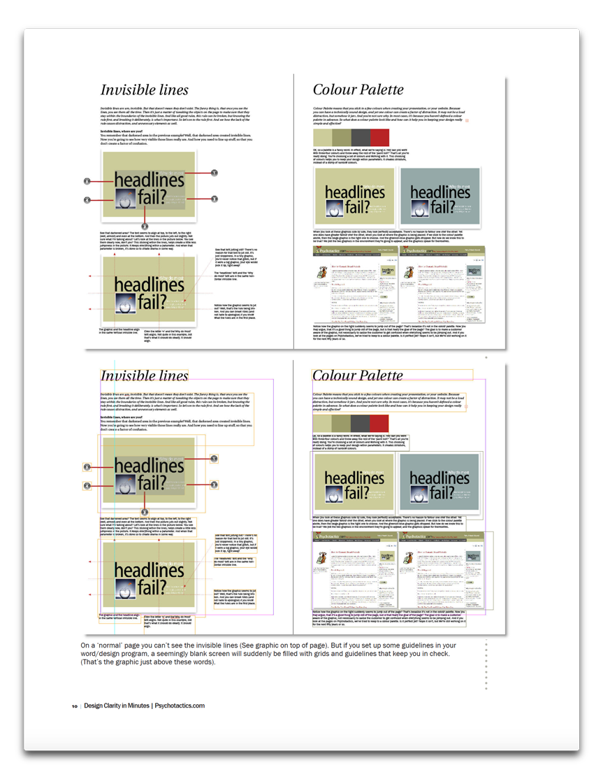
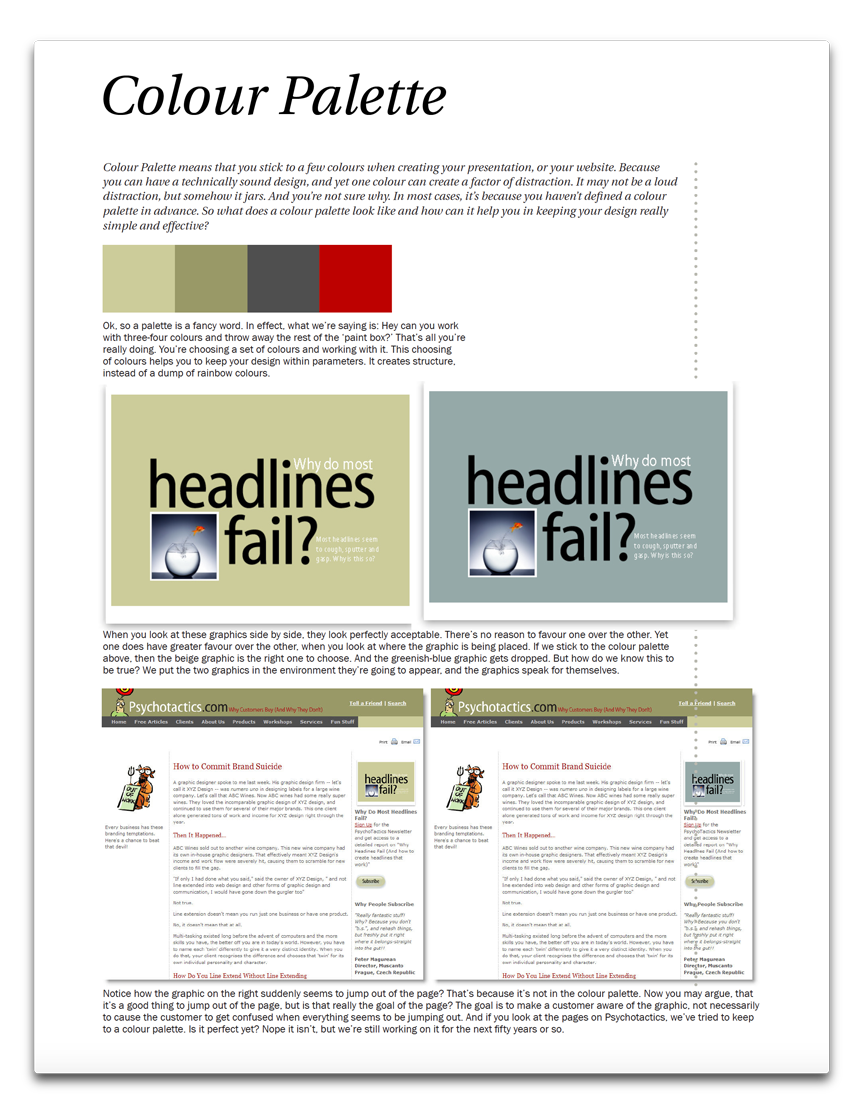
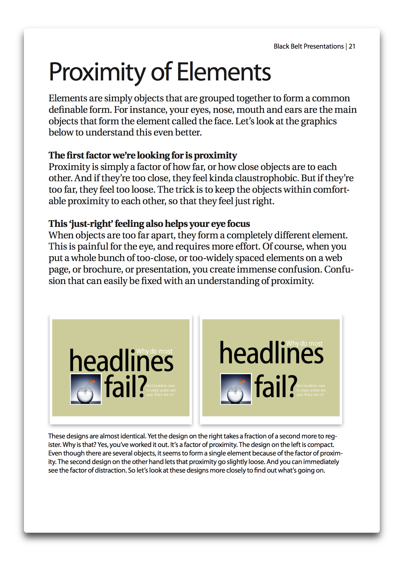
| Main learning Why you need Proximity of Elements What are Invisible Lines? What is a Colour Palette? |
|
| Price | $19.95 |
| Pay safely with any of these options
|
|
| Pay with any Credit Card | |
| Pay with Paypal | |
Important Details
If by any chance, you are not able to validate your card please don't tear your hair out in frustration. You can email Renuka and she will send you an ALTERNATE LINK to process your credit card. All payment systems are secure.
If you have any questions that have been unanswered, please email me directly and let me know how I can help. I'd be interested in getting you feedback. The feedback that you give me is strictly confidential.
Important Usage: What will happen once you click the button
—You will be taken to a page where you can fill out your credit card or cheque details.
—Once you pay you will be taken to a form.
—Once you fill the form, you will receive an email with more details.

Sean D'Souza
Psychotactics.com


